Please play this game.
…And another Videogame changes my life.
Why do chain restaurant websites refuse to put their hours on their websites or Store locators? Isn’t this the “information super-highway?”
Department of Spanish and Portuguese, UC Berkeley
Printing out this webpage on large paper would be really well balanced, laid out design.
But when looking at it on a screen, the canvas dimensions on the vertical axis approach infinity because of the ⤴ (icam150? mannovich and design choice bauhaus etc) the the process of scrolling has become a simple haptic motions: a curling, “come here” motion that the scroll wheel & touchpad mandate, as well as the momentum emulating flicks that touchscreen devices such as the iPhone, (and to a larger extent, the Nintendo Wii) are delving into.
As the people here at Information Architects say,
Most websites are crammed with small text that is a pain to read. Why? There is no reason for squeezing so much information onto the screen. It’s just a stupid collective mistake that dates back to a time when screens were really, really small.
Really. Lean back and look. Shock! Amaze! You can read the text! Relax.

While I’m taking notes, I need to type the kanji for “person”, so I hit the familiar command:
⌘+space, to switch into kotoeri (Japanese typing) mode.
But instead of typing “hito” for 人 (ã²ã¨-Person).
I keep typing “ppl” (PeoPLe).
How silly. The mind is so strange sometimes…
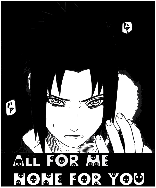
Sasuke vs. Itachi. The showdown we’ve all been waiting for has finally arrived.
Yeah I know its a bit late. I was just killing some time cleaning the above image in Ai and figured I’d post it up. Back to the essays…